2024-2025
Enhancing the Fleet Vehicle Details Experience
A leading truck and bus manufacturer wanted to enhance its fleet management platform to help customers monitor vehicle health, reduce downtime, and make informed maintenance decisions.
My contribution focused on improving the Fleet Vehicle Details page by bringing critical information and actions closer to the user.
This case study highlights my exploration of how vehicle health, faults, battery, and fuel information can be presented in a more intuitive and actionable way.
Project: Fleet Management Platform
Role: UX Designer (Interaction Design)
Focus Area: Fleet Vehicle Details Experience
Duration: Ongoing Product Enhancement
The Challenge
Fleet owners needed a faster way to understand vehicle status and take action when needed.
The experience needed to help users:
-
Monitor vehicle health remotely
-
Quickly identify faults and service issues
-
View vehicle location and status
-
Connect with service advisors
-
Find nearby service locations
-
Manage battery and fuel levels proactively
The challenge wasn't the lack of information—it was making the most important information visible at the right time without overwhelming the user.
My Role
As an Interaction Designer, I worked closely with product owners and engineers to:
-
Understand user and business needs
-
Map journeys and interaction flows
-
Explore layouts and information hierarchy
-
Create wireframes and UI concepts
-
Prepare detailed developer handoff specifications
The Challenge
Fleet owners needed a faster way to understand vehicle status and take action when needed.
The experience needed to help users:
-
Monitor vehicle health remotely
-
Quickly identify faults and service issues
-
View vehicle location and status
-
Connect with service advisors
-
Find nearby service locations
-
Manage battery and fuel levels proactively
The challenge wasn't the lack of information—it was making the most important information visible at the right time without overwhelming the user.
My Role
As an Interaction Designer, I worked closely with product owners and engineers to:
-
Understand user and business needs
-
Map journeys and interaction flows
-
Explore layouts and information hierarchy
-
Create wireframes and UI concepts
-
Prepare detailed developer handoff specifications
Image description

Understanding the Existing Experience
The existing application already had a strong foundation and connected multiple vehicle services effectively. While reviewing the experience, I noticed an opportunity to make better use of the available screen space and surface critical information earlier in the journey.
I spent time with fleet owners, product owners, and engineering teams to understand:
-
What information users check most frequently
-
Which actions require immediate attention
-
How vehicle telemetry data could support decision-making
I also explored the Azure telemetry platform to better understand the data available through APIs and how it could be leveraged in the experience.
Image description

Image description

Shaping the Experience
With the journey defined, I explored multiple layouts to prioritize the information users care about most. Working closely with engineers and product owners, the page gradually evolved into a focused dashboard that highlighted:
-
Vehicle health
-
Active faults and warnings
-
Battery and fuel status
-
Vehicle location
-
Remote controls
-
Service actions
The goal was simple: help users move from reviewing information to making decisions faster.
Image description

From Information to Action
I didn't want the experience to stop at showing battery or fuel levels.
Instead, I explored ways to help users take action when vehicle status becomes critical.
For low battery or fuel conditions, the experience:
-
Detects the vehicle location
-
Recommends nearby charging or fuel stations
-
Provides a direct path for navigation
This transformed the screen from a monitoring dashboard into a more proactive support tool.
Change this image below with the updated one.
Image description
Image description


Heading or headline
1. Add video screen below that shows the loading and revealing the stations, and
Day and night view of vehicle list map view.
2. Keep customer and dealer view image
Image description

Consistent Experience Across Vehicle Types
As I explored the solution further, I realized many customers manage both EV and fuel-powered vehicles. Rather than creating different experiences for each vehicle type, I designed a shared status card pattern that maintained the same layout and interaction model while adapting the content.
This created a more familiar and predictable experience across mixed fleets.
Image description

Responsive Scaling
Although the primary focus was mobile, I also explored how the experience could scale to desktop and fleet-monitoring environments. The goal was to maintain consistency while making better use of larger screens to provide additional context and visibility.
Image description


Mapping the Journey
Before designing screens, I mapped how fleet owners, drivers, dealerships, and connected systems interact with vehicle data. This exercise helped identify:
-
Critical touchpoints
-
Key decision moments
-
Areas where users need support
The resulting flows became the foundation for the experience design.
Personas
To balance operational and service needs, I focused on two key personas which helped shape a solution that supports both monitoring and service workflows.
Ryan (Fleet Owner & Driver): Needs quick visibility into vehicle health and maintenance needs.
Richard (Service Advisor): Helps customers diagnose issues and coordinate service actions.
Image description

Improving Battery Visibility
Battery status became one of the most interesting design challenges.
While exploring options, I looked at how apple wearable devices communicate critical information in limited space. Inspired by that approach, I replaced the traditional progress bar with a semi-circular gauge that felt more aligned with familiar vehicle dashboards. This helped:
-
Improve visibility
-
Save screen space
-
Increase scanability
-
Create a more automotive-inspired experience
Image description


Heading or headline
Description to understand the current notification landscape, I interviewed an experienced technical architect to identify all existing system communication trigger points. Subsequently, I conducted an open card sort with the Product Manager and Tech Lead to categorize these diverse trigger points originating from multiple sources.
Image description

Label
Label
Heading or headline
Description to understand the current notification landscape, I interviewed an experienced technical architect to identify all existing system communication trigger points. Subsequently, I conducted an open card sort with the Product Manager and Tech Lead to categorize these diverse trigger points originating from multiple sources.
Scroll right to see the complete image
Heading or headline
Description to understand the current notification landscape, I interviewed an experienced technical architect to identify all existing system communication trigger points. Subsequently, I conducted an open card sort with the Product Manager and Tech Lead to categorize these diverse trigger points originating from multiple sources.
Scroll right to see the complete image

Heading or headline
Description to understand the current notification landscape, I interviewed an experienced technical architect to identify all existing system communication trigger points. Subsequently, I conducted an open card sort with the Product Manager and Tech Lead to categorize these diverse trigger points originating from multiple sources.
Scroll right to see the complete image
Heading or headline
Description to understand the current notification landscape, I interviewed an experienced technical architect to identify all existing system communication trigger points. Subsequently, I conducted an open card sort with the Product Manager and Tech Lead to categorize these diverse trigger points originating from multiple sources.
Developer Handoff
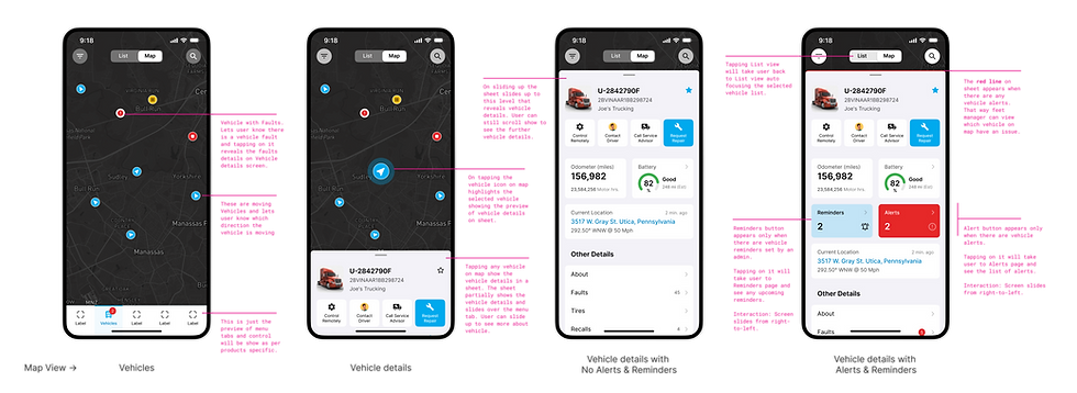
Actually design isn't complete until it is implemented successfully. To reduce ambiguity during development, I created detailed specifications covering:
-
Component behavior
-
Interaction states
-
Responsive behavior
-
Edge cases
Clear annotations and visual references helped streamline communication and reduce implementation questions.
Outcome
Although this case study focuses primarily on the design exploration, the enhancements helped move the experience closer to the client's vision of a proactive fleet management platform.
The proposed experience aimed to:
-
Bring vehicle health information into immediate focus
-
Improve visibility of vehicle faults and warnings
-
Support faster decision-making for fleet owners
-
Create consistency across EV and fuel-powered vehicles
-
Connect users with nearby support, service, and charging options
-
Reduce the effort required to monitor and maintain fleet health
Most importantly, the experience evolved from simply displaying data to helping users understand what action to take next.
Key Learnings
Every project teaches something new, and this one was particularly valuable because it combined automotive design, telemetry data, and service experiences.
-
Design Beyond Information: Users often need guidance, not just data. Providing the next best action can be more valuable than showing another metric.
-
Small Changes Create Big Impact: Simple improvements, like redesigning the battery indicator, can significantly improve usability and visibility.
-
Understanding the Technology Matters: Exploring telemetry data early helped uncover opportunities that informed more practical design solutions.
-
Collaboration Improves Outcomes: Many of the strongest ideas emerged through close collaboration with engineering and product teams.
-
Consistency Builds Trust: A familiar experience across vehicle types makes the platform easier to learn and use.
That concludes
How it started