2024-2025
Fleet Health & Battery Experience
Redesigning the fleet details screen for a commercial vehicle manufacturer
A leading truck and bus manufacturer wanted to enhance its fleet management platform to help customers monitor vehicle health, reduce downtime, and make informed maintenance decisions.
My contribution focused on improving the Fleet Vehicle Details page by bringing critical information and actions closer to the user.
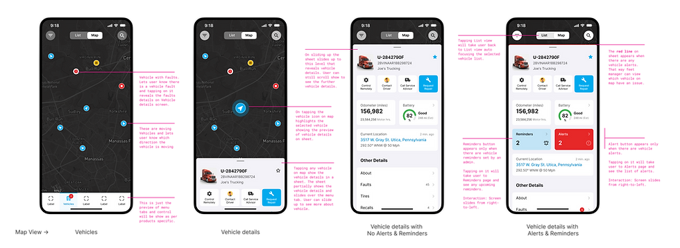
This case study highlights my exploration of how vehicle health, faults, battery, and fuel information can be presented in a more intuitive and actionable way.
Project: Fleet Management Platform
Role: UX Designer (Interaction Design)
Focus Area: Fleet Vehicle Details Experience
Duration: Ongoing Product Enhancement
The Challenge
Fleet owners needed a faster way to understand vehicle status and take action when needed.
The experience needed to help users:
-
Monitor vehicle health remotely
-
Quickly identify faults and service issues
-
View vehicle location and status
-
Connect with service advisors
-
Find nearby service locations
-
Manage battery and fuel levels proactively
The challenge wasn't the lack of information—it was making the most important information visible at the right time without overwhelming the user.
My Role
As an Interaction Designer, I worked closely with product owners and engineers to:
-
Understand user and business needs
-
Map journeys and interaction flows
-
Explore layouts and information hierarchy
-
Create wireframes and UI concepts
-
Prepare detailed developer handoff specifications
Quick Summary
I worked on redesigning the fleet details screen so drivers could see the most important information — faults, location, battery/fuel status — right away, without scrolling or searching. The part I focused on most was the battery/fuel section: instead of just showing a warning, it now points the driver to the nearest charging or fuel station.
Role: Interaction Designer
Worked with: Product Owner, Engineering team, Telemetry team (Azure)
Users: Fleet owners/drivers, Dealership service advisors
Context
The existing app wasn't broken — it was well organized. But the important stuff (faults, low battery, anything needing action) didn't stand out from routine information. Users had to dig for what actually mattered.
The client wanted remote vehicle control, fault alerts with repair requests, live vehicle status, a way to reach a service advisor, and reminders for timely servicing. My focus was simpler — make the first screen someone sees actually help them, not just inform them.
One thing that mattered early on: the vehicle data came through Azure. Before designing anything, I checked the actual telemetry data available through the API. This helped me stay realistic about what we could show, instead of designing something engineering couldn't support later.
How it started
Image description

What I Did
Started with conversations, not screens.
Talked to fleet owners, the product owner, and engineers to understand what was actually frustrating people, versus what were just nice-to-have ideas.
Image description

Image description

Image description

Image description

Shaping the Experience
Treated space as the real problem.
The ask was to fit more important information into the same screen. Instead of cramming things in, I rethought how information was shown. The battery indicator, for example, moved from a simple bar to a semi-circular gauge — inspired by how car dashboards and the Apple Watch show information at a glance. It felt more natural and easier to read quickly.
Image description

From Information to Action
Made the battery/fuel alert actually useful.
This was the part I cared about most. When battery or fuel is low, the app doesn't just say so — it shows the nearest charging or fuel station and lets the user navigate there directly.
Image description
Image description


Heading or headline
1. Add video screen below that shows the loading and revealing the stations, and
Day and night view of vehicle list map view.
2. Keep customer and dealer view image
Image description

Consistent Experience Across Vehicle Types
Kept one design for both EV and fuel vehicles.
Rather than designing two separate experiences, I used the same tile and layout for both vehicle types. This kept things consistent for users and simpler to build and maintain for engineering.
Image description

Responsive Scaling
Although the primary focus was mobile, I also explored how the experience could scale to desktop and fleet-monitoring environments. The goal was to maintain consistency while making better use of larger screens to provide additional context and visibility.
Image description


Mapping the Journey
Before designing screens, I mapped how fleet owners, drivers, dealerships, and connected systems interact with vehicle data. This exercise helped identify:
-
Critical touchpoints
-
Key decision moments
-
Areas where users need support
The resulting flows became the foundation for the experience design.
Personas
Mapped out how everyone uses the app.
Looked at the journey for three people — the driver, the fleet owner, and the dealership advisor — before starting on layouts. This helped make sure the design worked for everyone, not just one type of user.
Personas
Ryan (Fleet Owner & Driver): Needs quick visibility into vehicle health and maintenance needs.
Richard (Service Advisor): Helps customers diagnose issues and coordinate service actions.
Image description


Heading or headline
Description to understand the current notification landscape, I interviewed an experienced technical architect to identify all existing system communication trigger points. Subsequently, I conducted an open card sort with the Product Manager and Tech Lead to categorize these diverse trigger points originating from multiple sources.
Image description

Label
Label
Heading or headline
Description to understand the current notification landscape, I interviewed an experienced technical architect to identify all existing system communication trigger points. Subsequently, I conducted an open card sort with the Product Manager and Tech Lead to categorize these diverse trigger points originating from multiple sources.
Scroll right to see the complete image
Heading or headline
Description to understand the current notification landscape, I interviewed an experienced technical architect to identify all existing system communication trigger points. Subsequently, I conducted an open card sort with the Product Manager and Tech Lead to categorize these diverse trigger points originating from multiple sources.
Scroll right to see the complete image

Heading or headline
Description to understand the current notification landscape, I interviewed an experienced technical architect to identify all existing system communication trigger points. Subsequently, I conducted an open card sort with the Product Manager and Tech Lead to categorize these diverse trigger points originating from multiple sources.
Scroll right to see the complete image
Heading or headline
Description to understand the current notification landscape, I interviewed an experienced technical architect to identify all existing system communication trigger points. Subsequently, I conducted an open card sort with the Product Manager and Tech Lead to categorize these diverse trigger points originating from multiple sources.
Developer Handoff
Paid close attention during handoff.
I made sure the specs I gave engineering were detailed and clear, so we didn't lose time going back and forth in extra meetings. This improved communication gap and saved time of repeatative meeting.
Outcome
Although this case study focuses primarily on the design exploration, the enhancements helped move the experience closer to the client's vision of a proactive fleet management platform.
The proposed experience aimed to:
-
Bring vehicle health information into immediate focus
-
Improve visibility of vehicle faults and warnings
-
Support faster decision-making for fleet owners
-
Create consistency across EV and fuel-powered vehicles
-
Connect users with nearby support, service, and charging options
-
Reduce the effort required to monitor and maintain fleet health
Most importantly, the experience evolved from simply displaying data to helping users understand what action to take next.
Key Learnings
Every project teaches something new, and this one was particularly valuable because it combined automotive design, telemetry data, and service experiences.
-
Design Beyond Information: Users often need guidance, not just data. Providing the next best action can be more valuable than showing another metric.
-
Small Changes Create Big Impact: Simple improvements, like redesigning the battery indicator, can significantly improve usability and visibility.
-
Understanding the Technology Matters: Exploring telemetry data early helped uncover opportunities that informed more practical design solutions.
-
Collaboration Improves Outcomes: Many of the strongest ideas emerged through close collaboration with engineering and product teams.
-
Consistency Builds Trust: A familiar experience across vehicle types makes the platform easier to learn and use.